
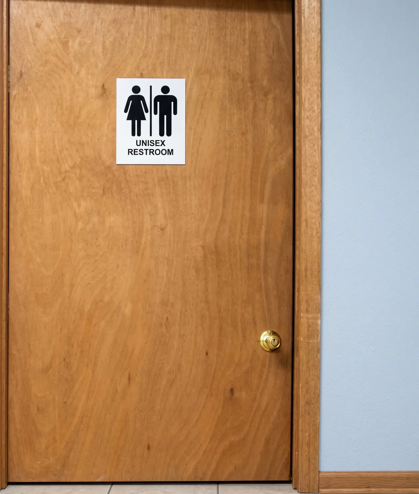
Do you see it?
In reviewing current restroom signage, there’s sufficient contrast between figures, text and background, making the current sign easy to identify by many visitors from a distance when the door is closed or partially open.
What’s missing?
The sign needs raised letters with Braille characters located below the letters for patrons who are blind or have low vision. Restrooms are required to have both visual characters with adequate contrast, and tactile indicators. Pictograms are not specifically required for restrooms, unless it’s the International Symbol of Accessibility needed to identify an accessible restroom. Still, pictograms can be useful when paired with required characters for individuals who are better able to perceive common images versus individual letters.
Signs are required to be on the adjacent wall on the latch side of the door instead of placed directly on the door (with few exceptions).
What other accessibility feature is needed?
The current doorknob requires the user to grab and twist it. A lever handle that can be moved with one hand, or even one or more fingers, provides greater access to individuals with variable hand dexterity.